02 / BRISK
TURNING PACKAGING INTO CULTURE.
Senior Art Director / PepsiCo
BRAND REINVENTION / PACKAGING / ARTIST COLLABORATION / VISUAL IDENTITY


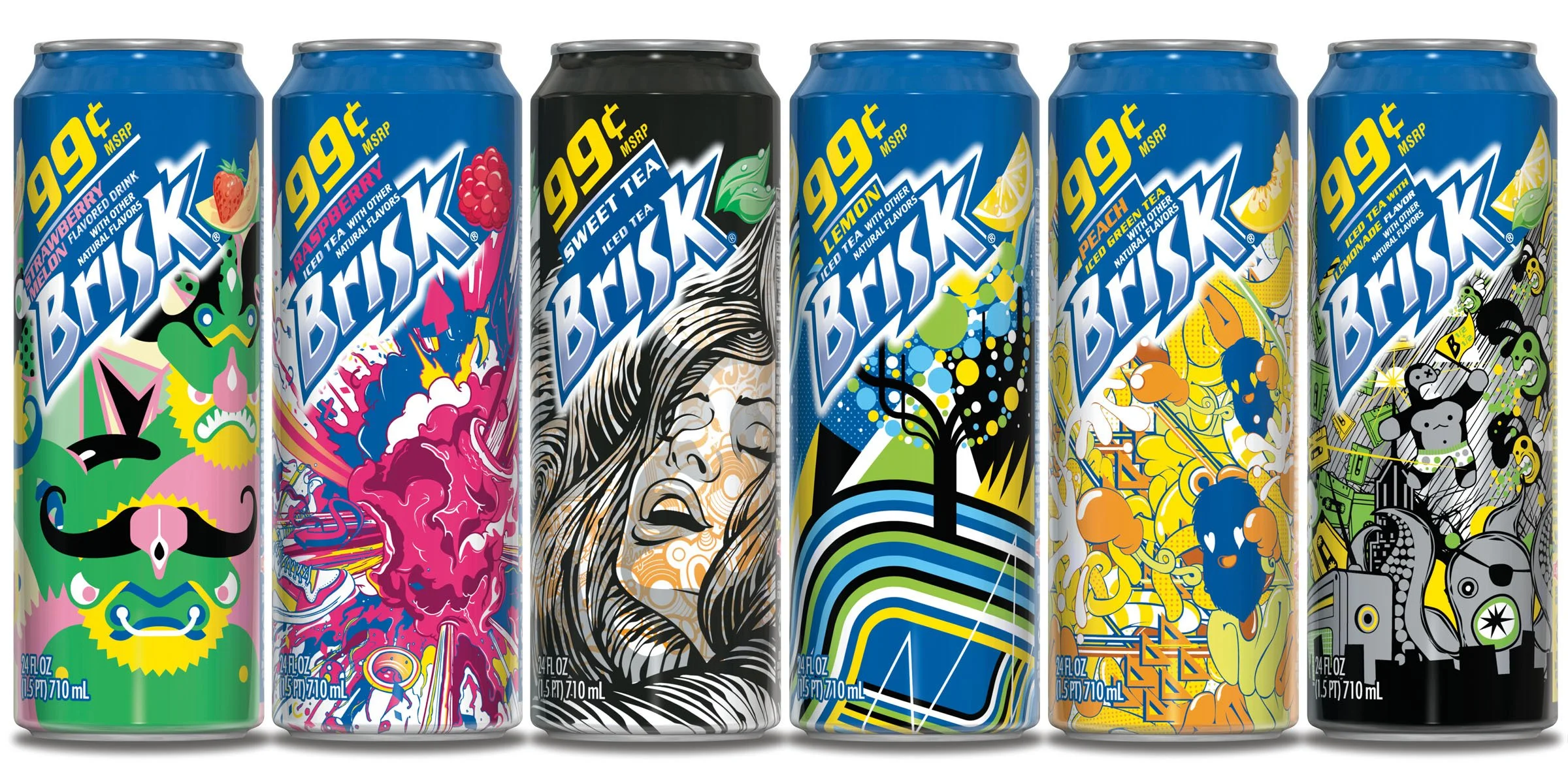
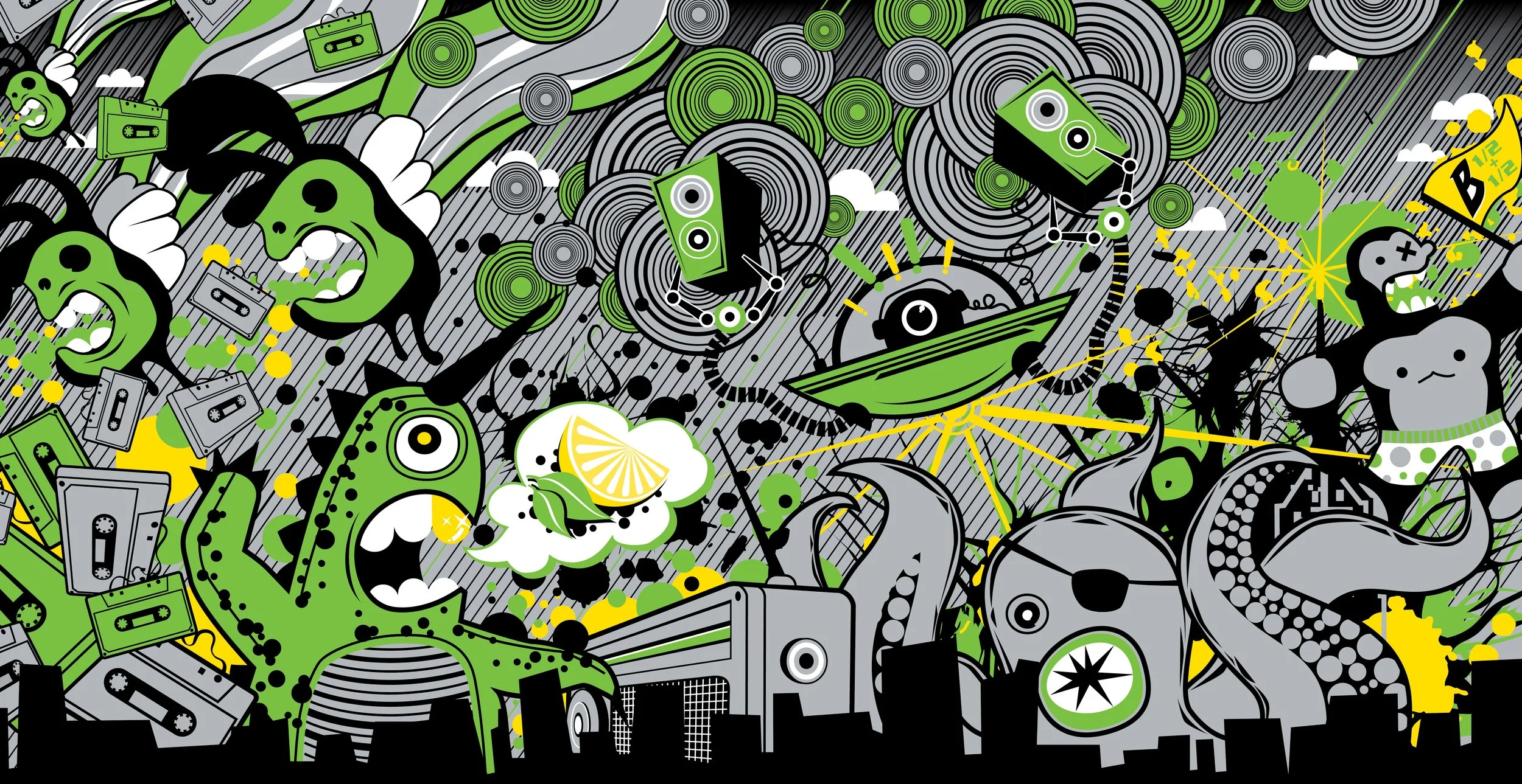
REFRESHING ARTISTS / BRISK 24 OZ. CAN SERIES
THIS WASN’T A REDESIGN.
IT WAS A RELAUNCH.
THE CHALLENGE
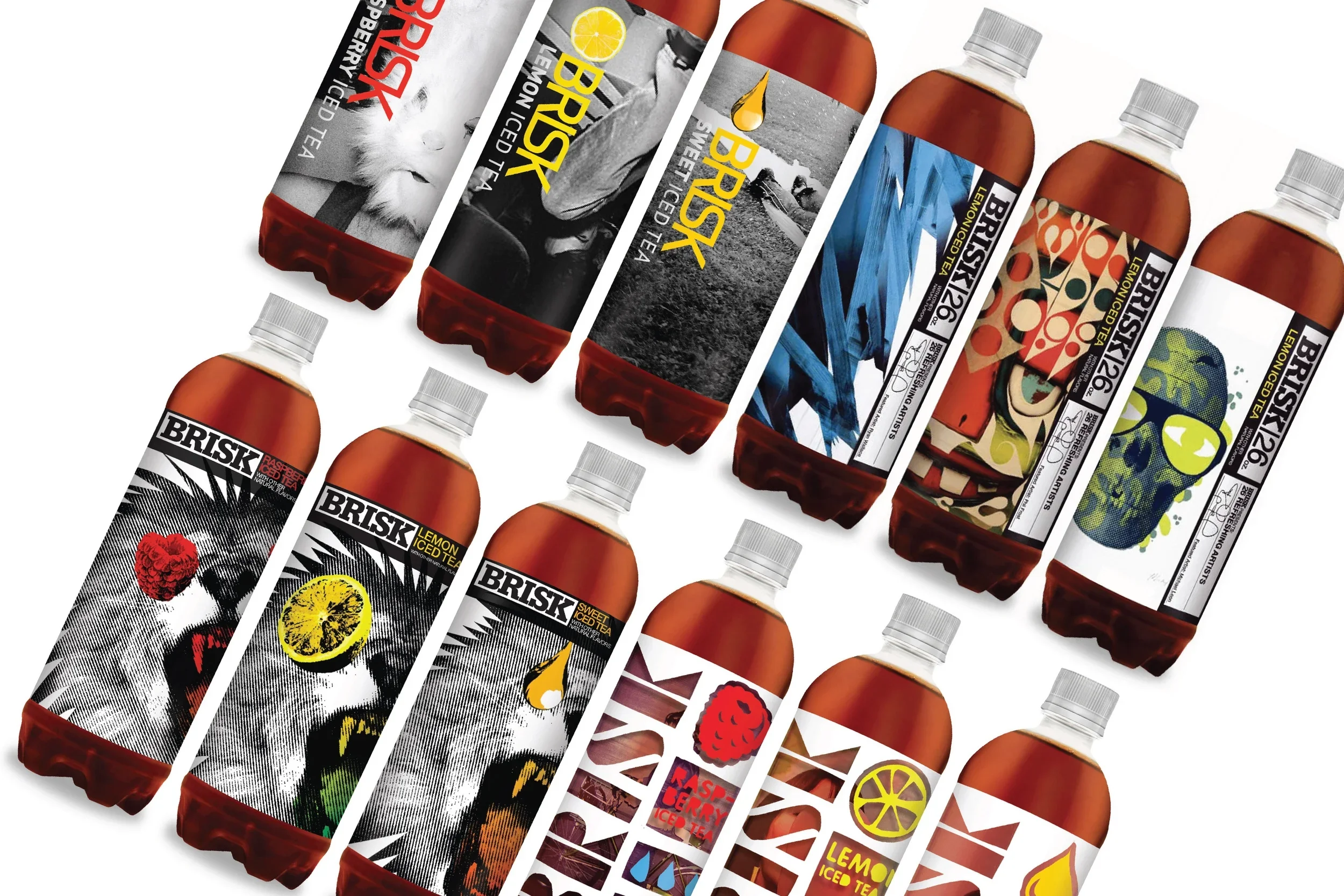
PACKAGING REDESIGN EXPLORATION
Brisk was a fading band in need of more than refreshed graphics. My brand partner and I were given significant creative runway - and a clear mandate: reintroduce Brisk with an entirely new identity, personality and point of view.
We explored deliberately provocative directions before landing on an idea that would fundamentally change the role packaging played for the brand.
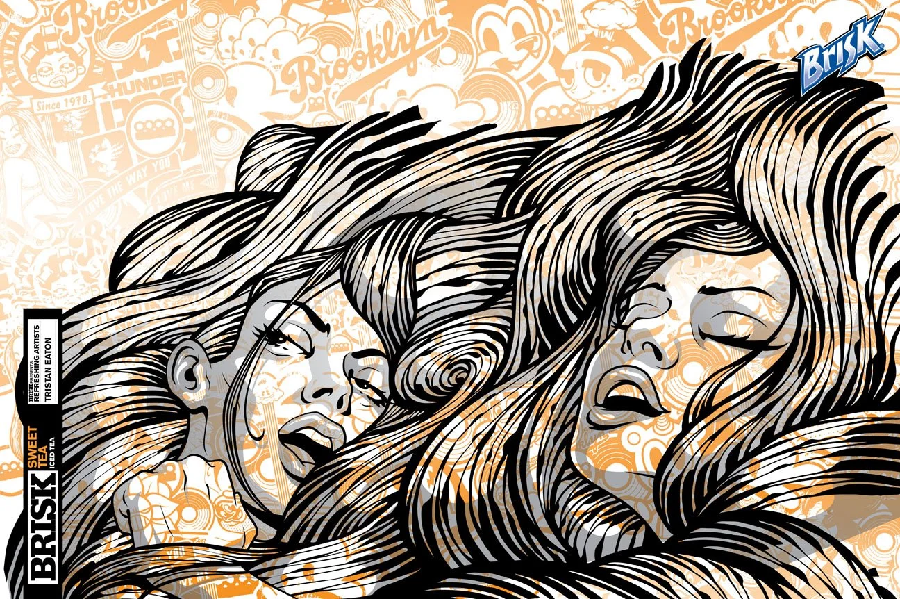
“WHAT DOES SWEET TEA FEEL LIKE TO YOU?”
REFRESHING ARTISTS SERIES / THE IDEA
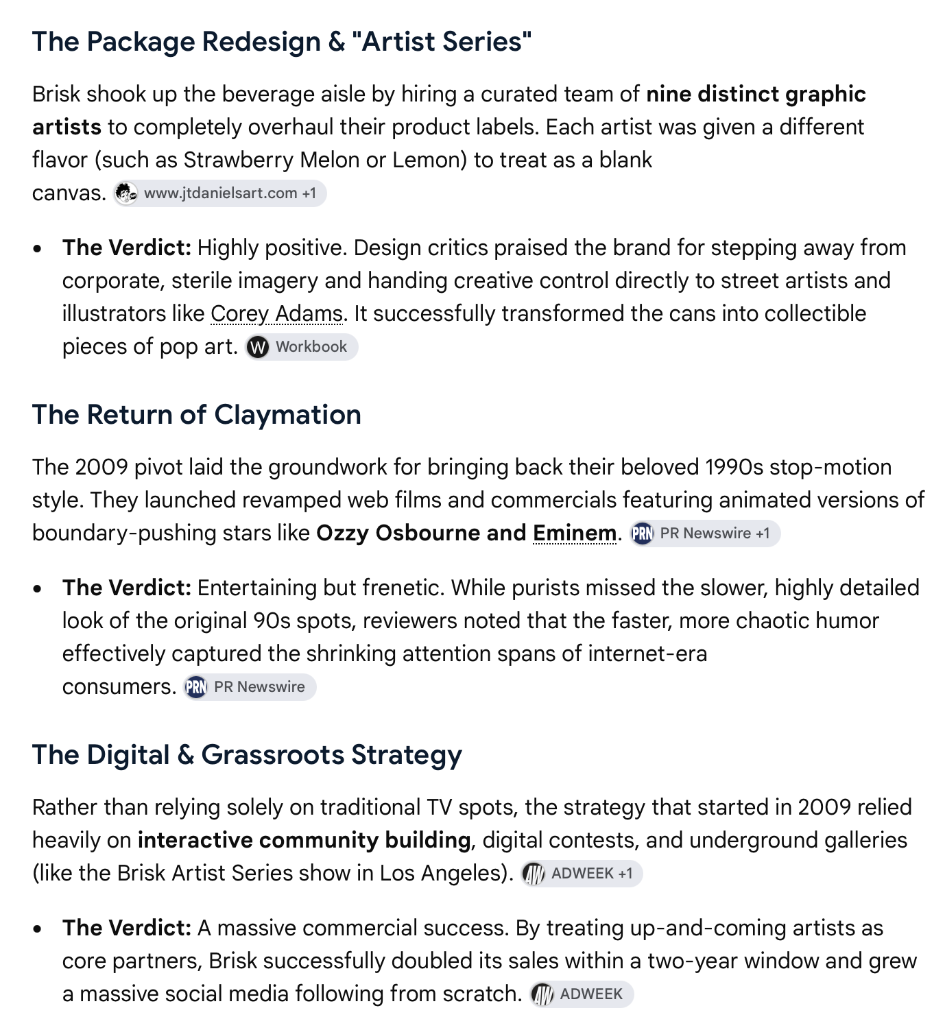
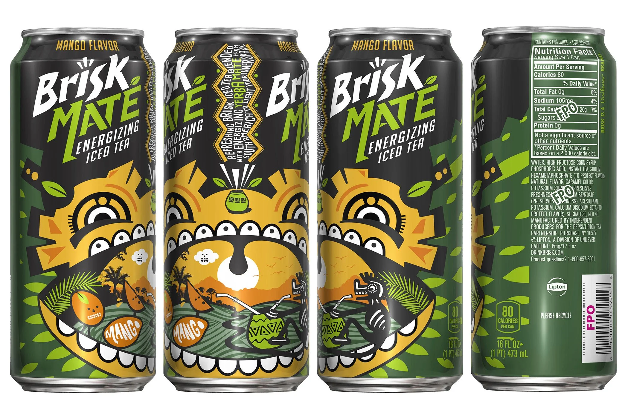
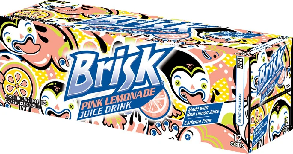
We curated renowned street artists from around the world, assigned flavors, and gave them one of the simplest briefs imaginable: interpret the flavor through your own visual language.
The goal wasn’t a house style. It was authentic expression within a brand architecture strong enough to hold it all together.
VISUALLY.
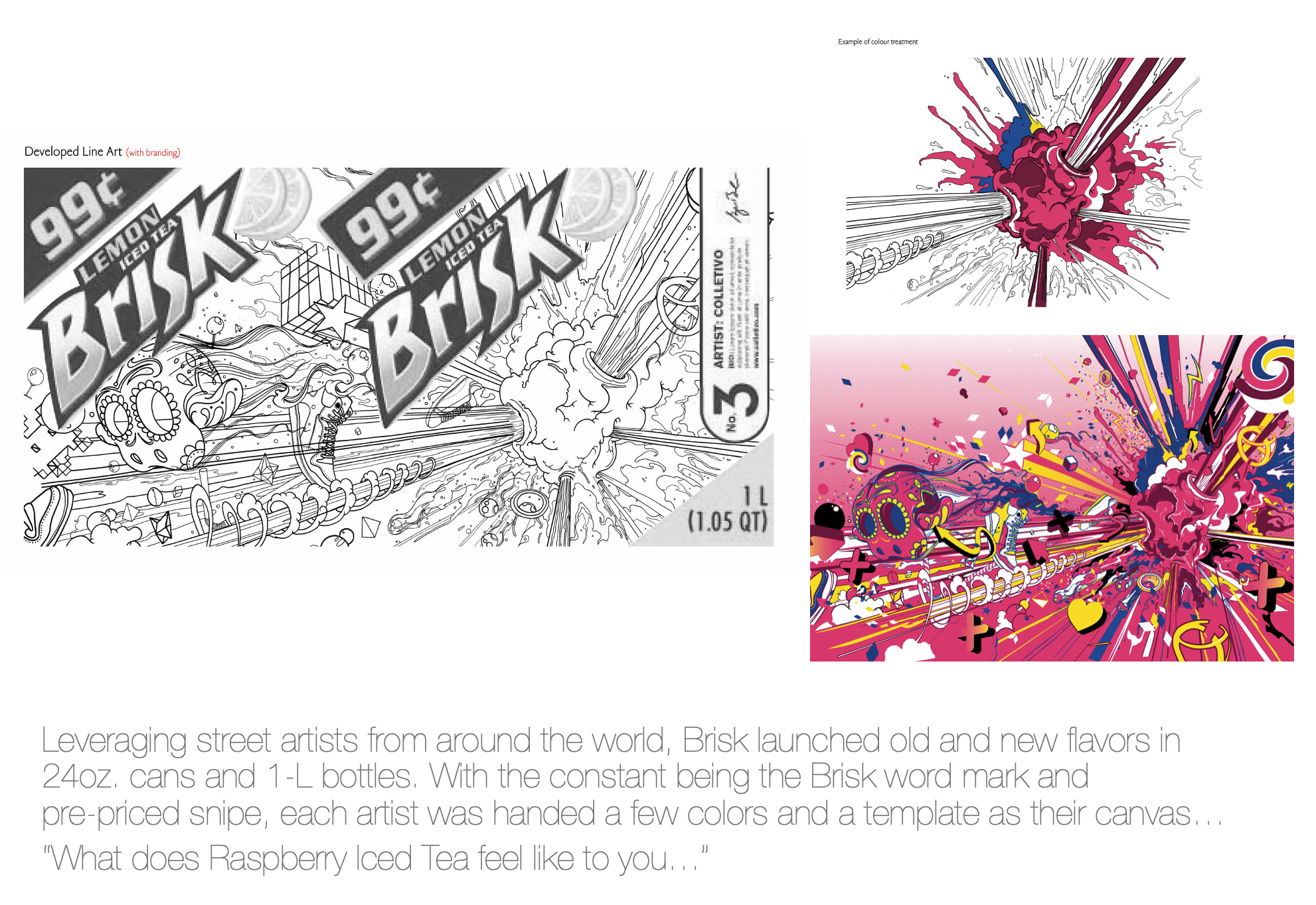
JOHN MCFAUL / RASPBERRY ICED TEA / ORIGINAL ARTWORK → COLOR DEVELOPMENT →
PACKAGE DESIGN
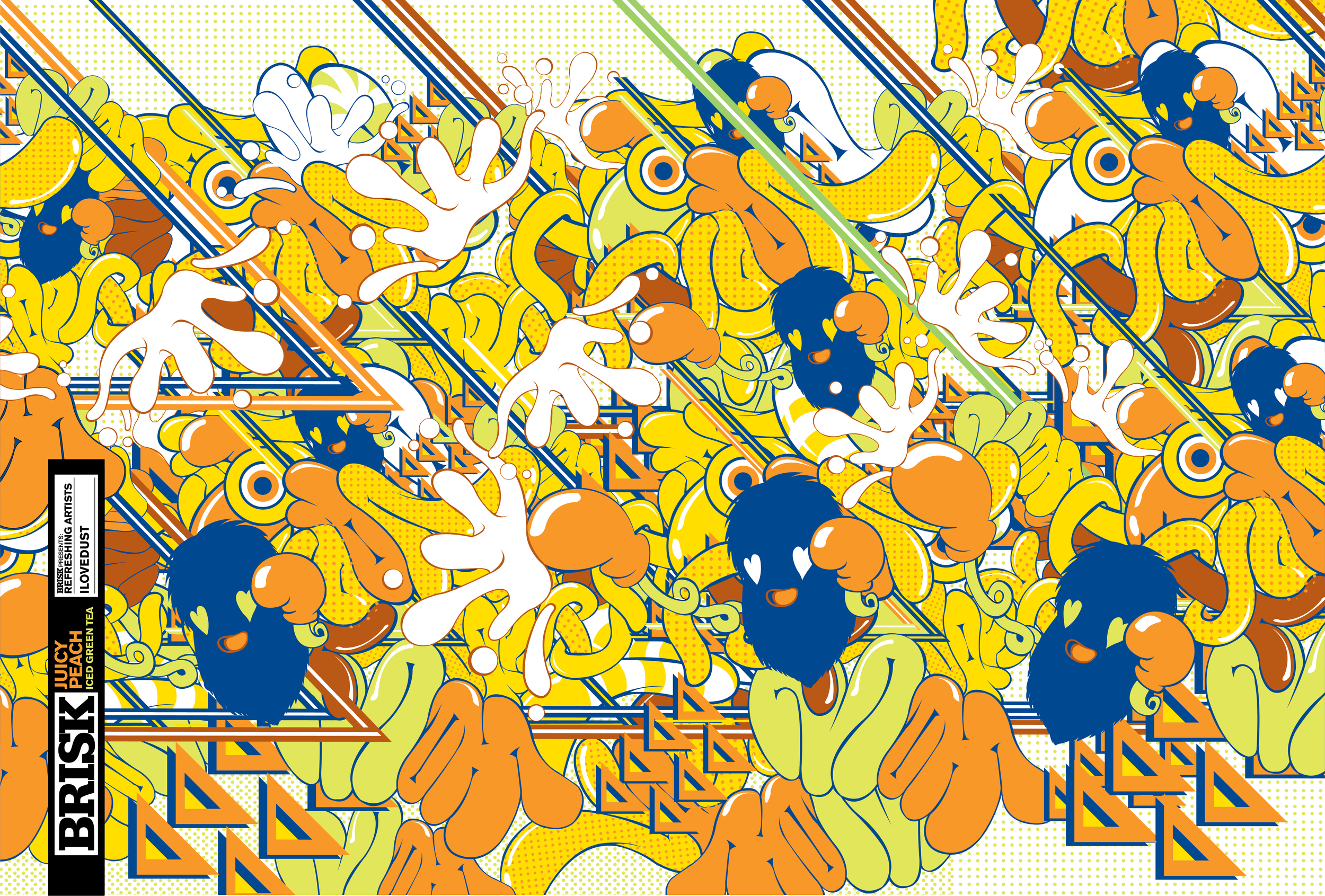
ONE ARTIST. ONE FLAVOR. ONE ORIGINAL CANVAS.
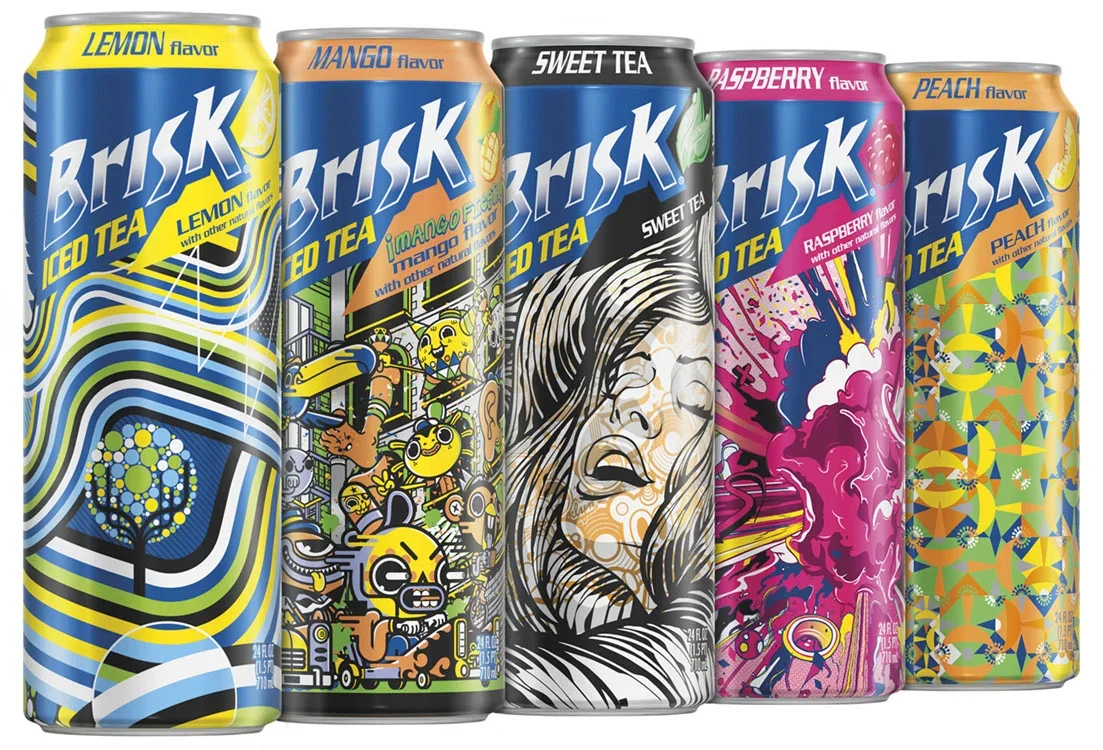
THE PACKAGE BECAME THE CAMPAIGN
AND THE NEW BRAND IDENTITY

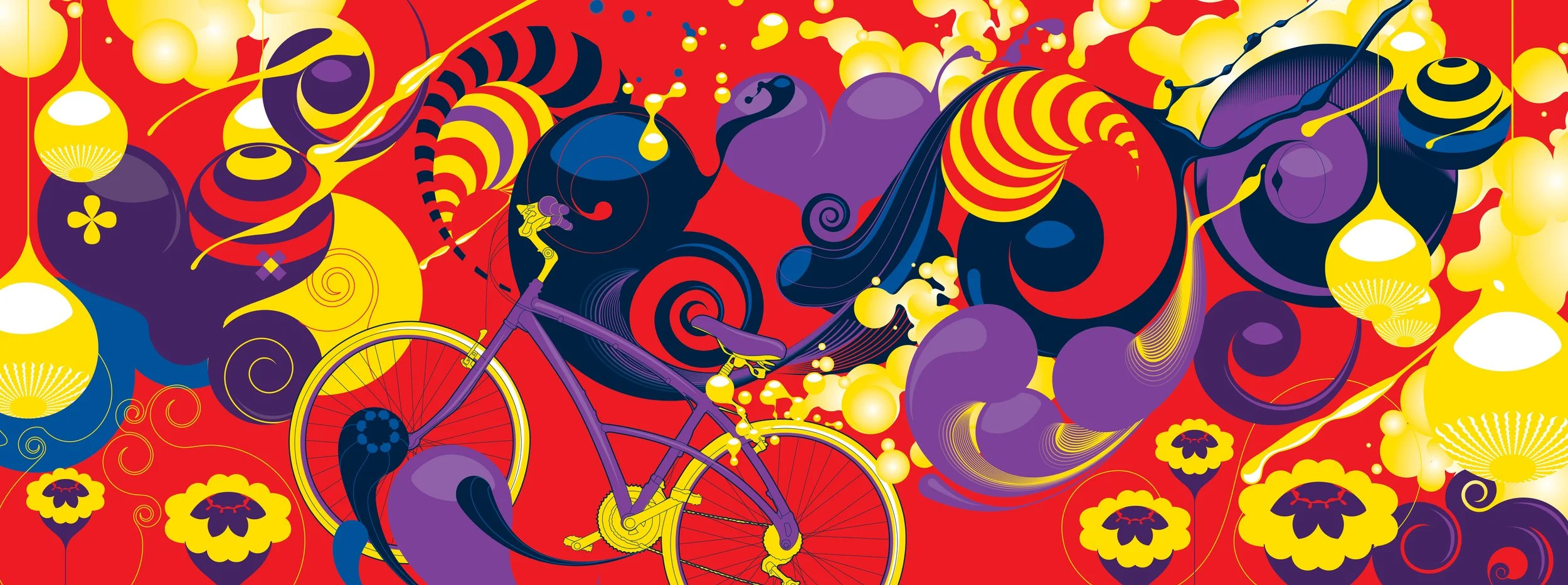


~ MORNING BREATH
BUILDING THE SYSTEM / CONTROLLED CHAOS
BUILDING A SYSTEM AROUND INDIVIDUALITY.
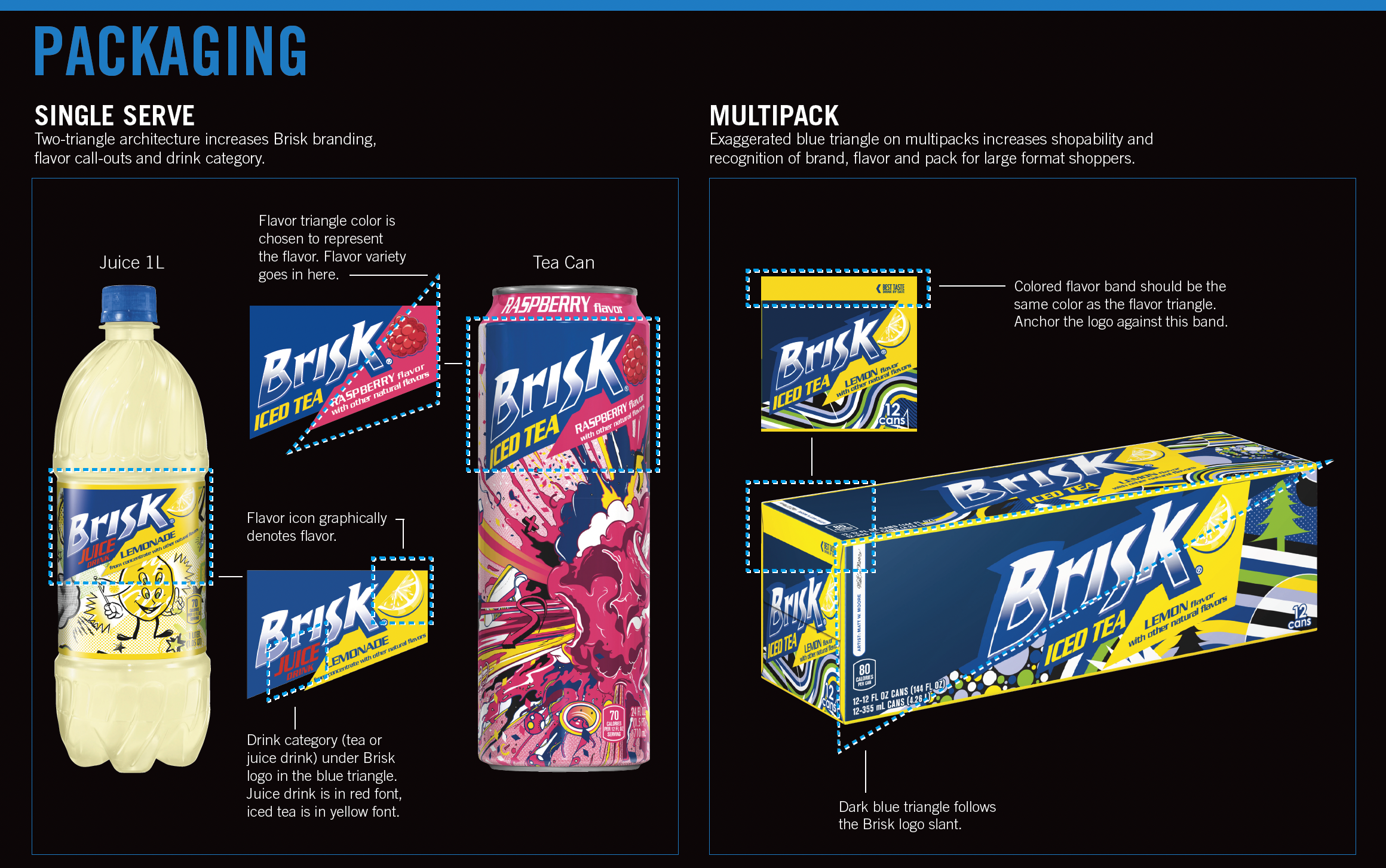
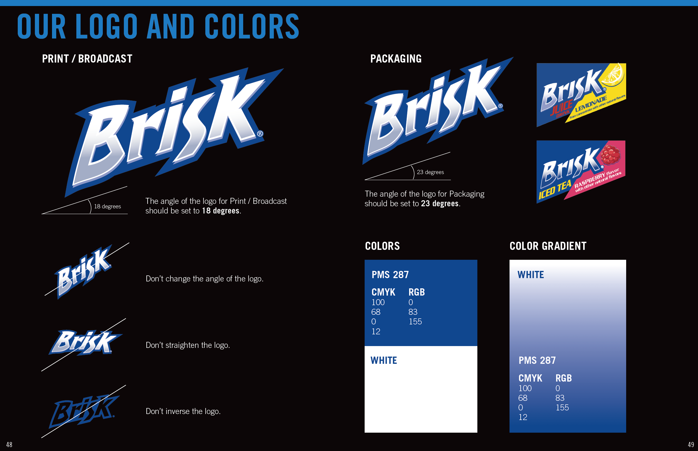
I directed a creative studio in developing the new Brisk packaging architecture - the canvas for every artist, flavor and format. Consistent equities such as the Brisk word mark, flavor coding, hierarchy and package geometry gave the artists the space to go wild without losing the brand.
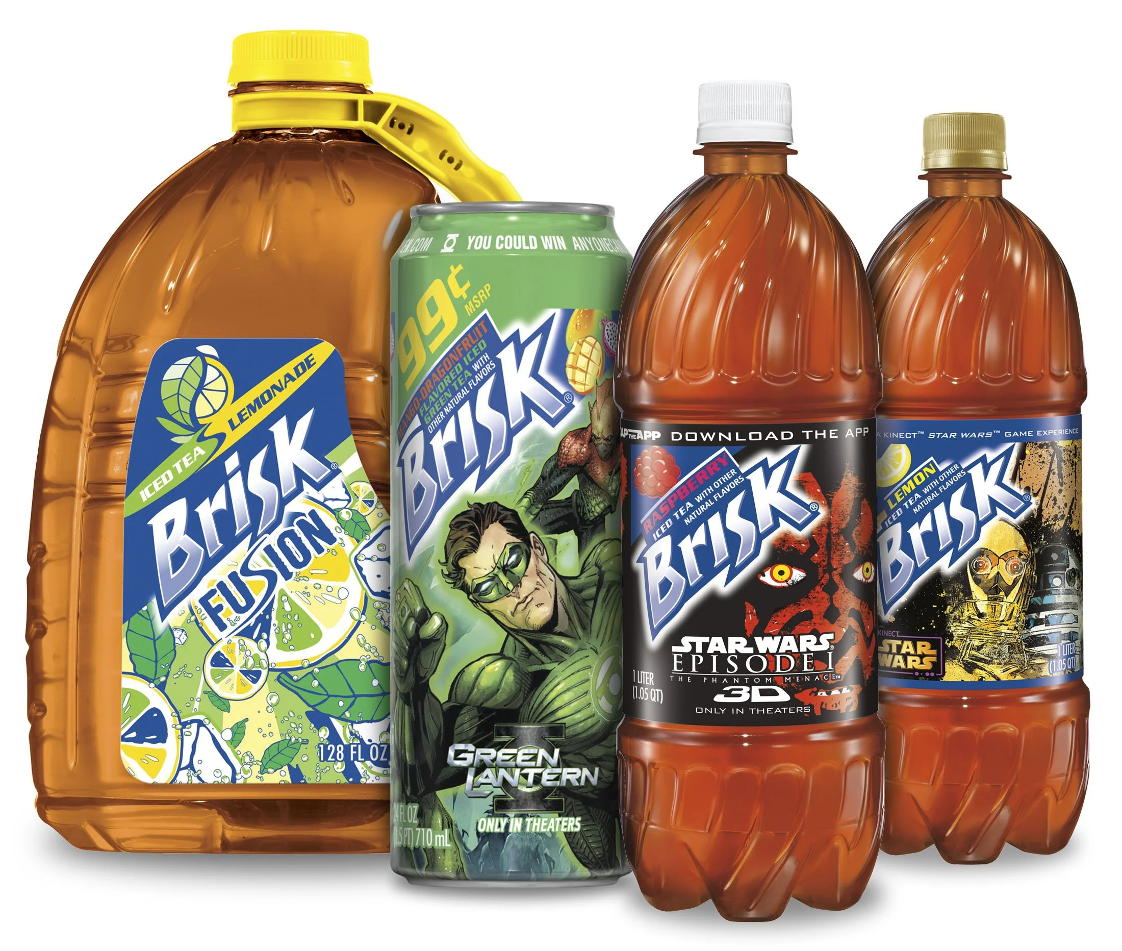
THE SYSTEM EXPANDED / INNOVATION
FROM FADING BRAND TO BILLION-DOLLAR BRAND.
THE IMPACT

$1B+
ANNUAL RETAIL SALES / 2011
2x
VOLUME IN TWO YEARS
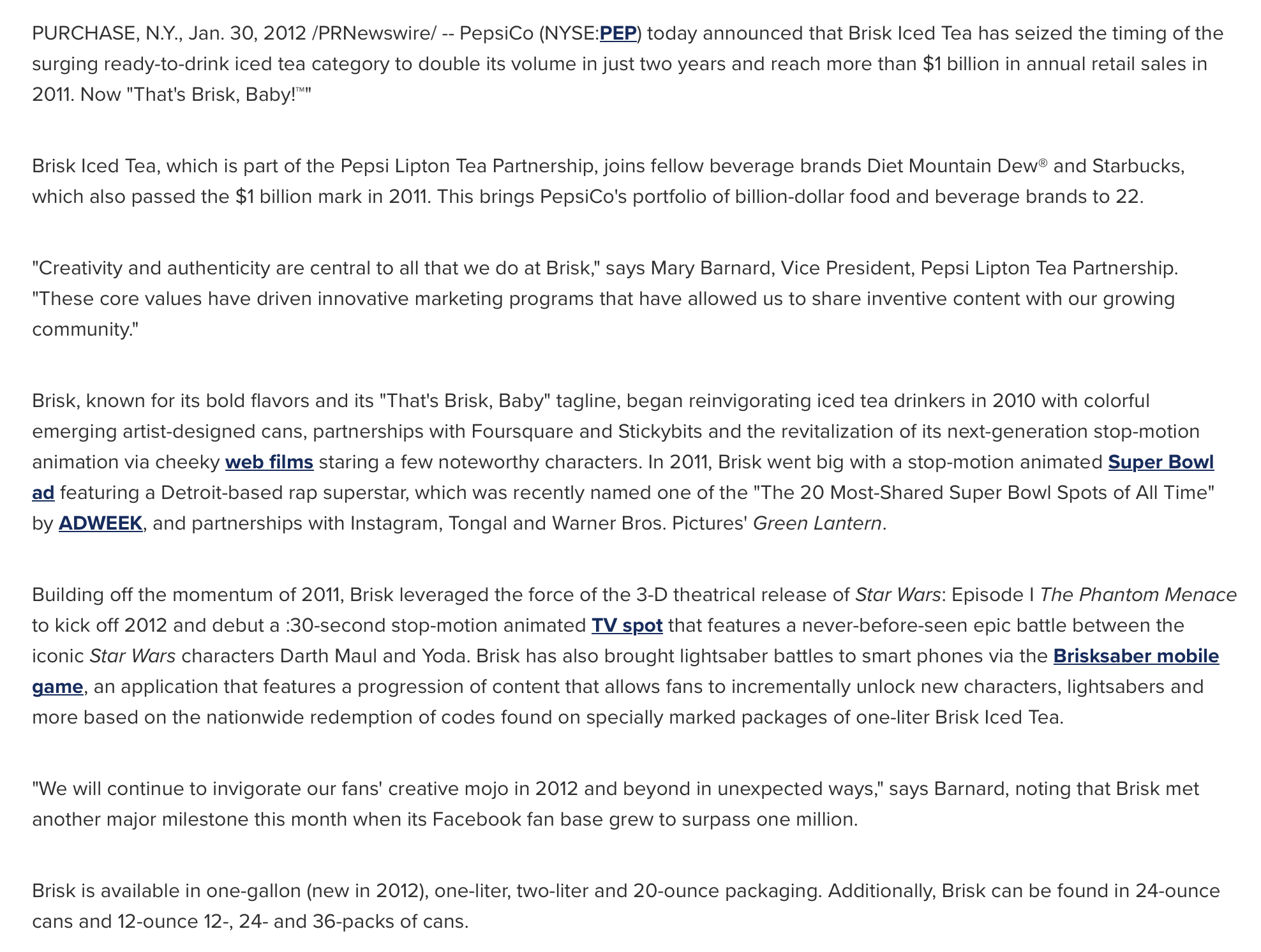
BILLION DOLLAR BRANDS CLUB / PEPSICO 2012