Packaging

If it’s possible to have a revolutionary evolution of already existing iconic packaging, this was it. Worked in tandem with agency partner on design and development, including intensive production phase and on-site press approvals.

We went for the icy chill vibe while still connoting patriotic red/white/blue for a summertime (2025) release. Explored and utilized premium metallic inks for each color.

We went for a radioactive neon green earthquake of sour apple flavor!
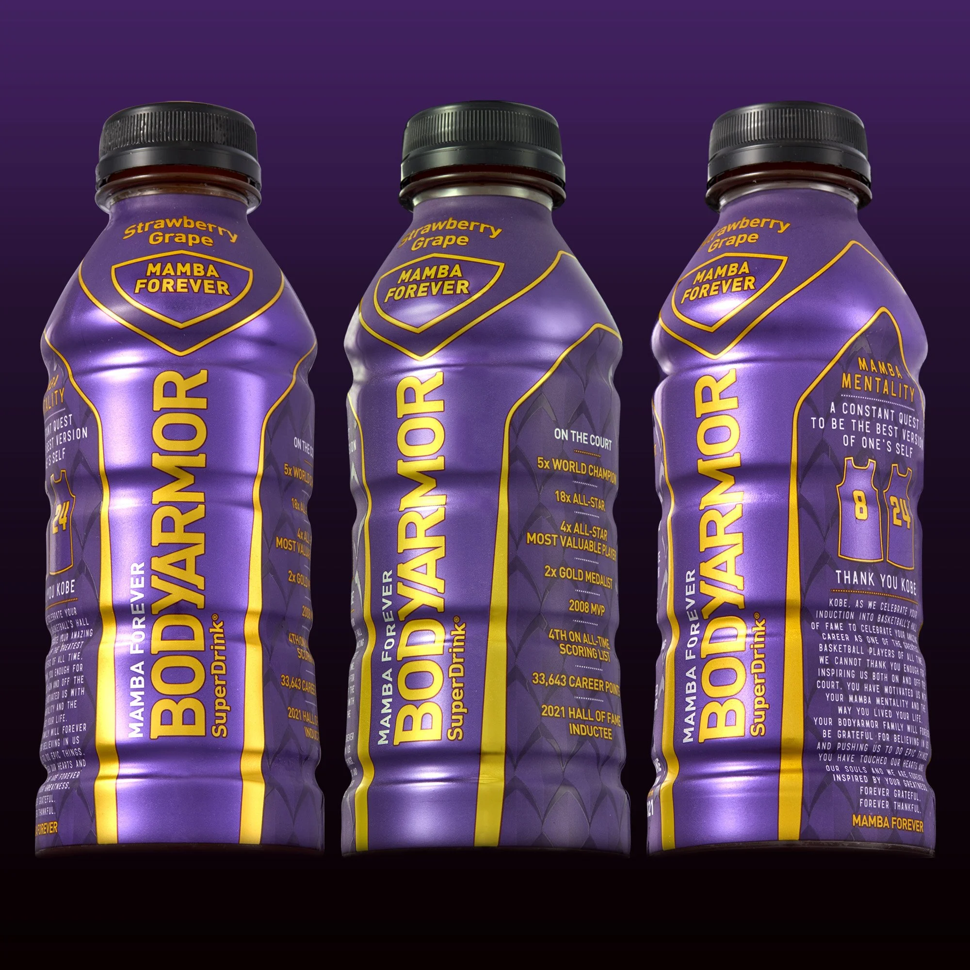
We owe everything to Kobe, and honored him posthumously with this special edition Basketball Hall of Fame bottle, using custom metallic inks and holographic foil.

We resourced agencies but inevitably went with my clean and colorful packaging.

As Creative Director of Packaging & Innovation, I not only manage our label designs but create them as well. For this one I was inspired by sunsets viewed from our 4th floor office window in Whitestone, Queens, which led me to design this stunning background gradient.

My take on this unique and “zany” partnership with the dudes. These labels wrecked guidelines by cleverly angling a neon, glow-in-the-dark popsicle, generating huge consumer interest and incremental sales.

Special Edition abstract label design produced with tactile ink and matte varnish.

Canadian bilingual label featuring beautifully crafted illustration of the best hockey player on the planet.
Led the transition from a recessive silver label to this bold almost overpowering white version.. and the sales have reflected this move.
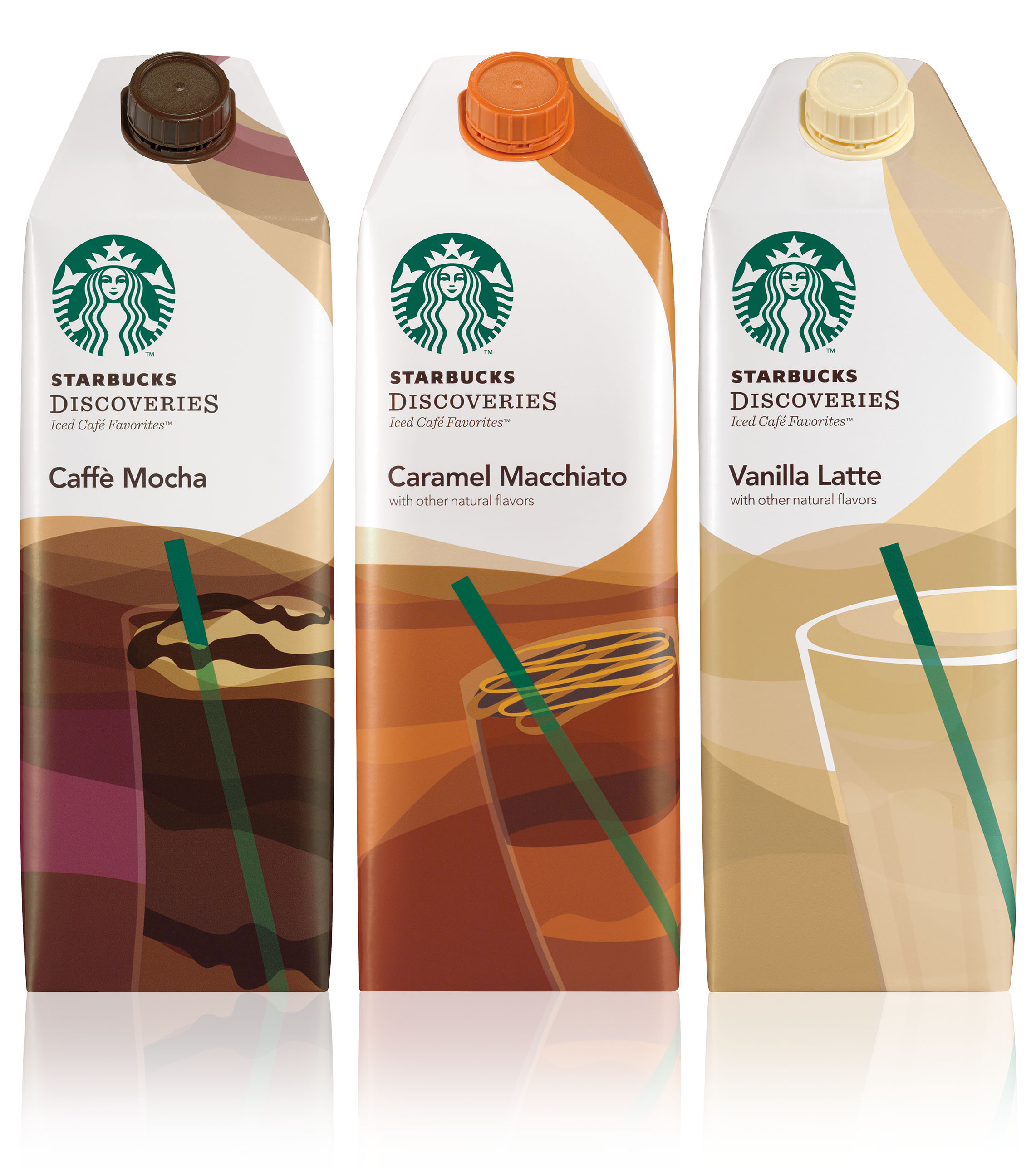
My role as Starbucks A.D. was that of creative manager and consultant for the RTD (ready to drink) partnership. Every now and then I was able to pull in a solo design project, such as these Discoveries cartons. Keeping with the brand essence, I designed these packs to permeate the elegance and warmth of the coffeehouse environment.

Fun to jump outside of your comfort zone every once in a while, and important for a designer to dive into fresh challenges. I was design lead on Pure Leaf for a year in the Design & Innovation Center, and was able to design packaging (such as this 4-pack), as well as art direct.
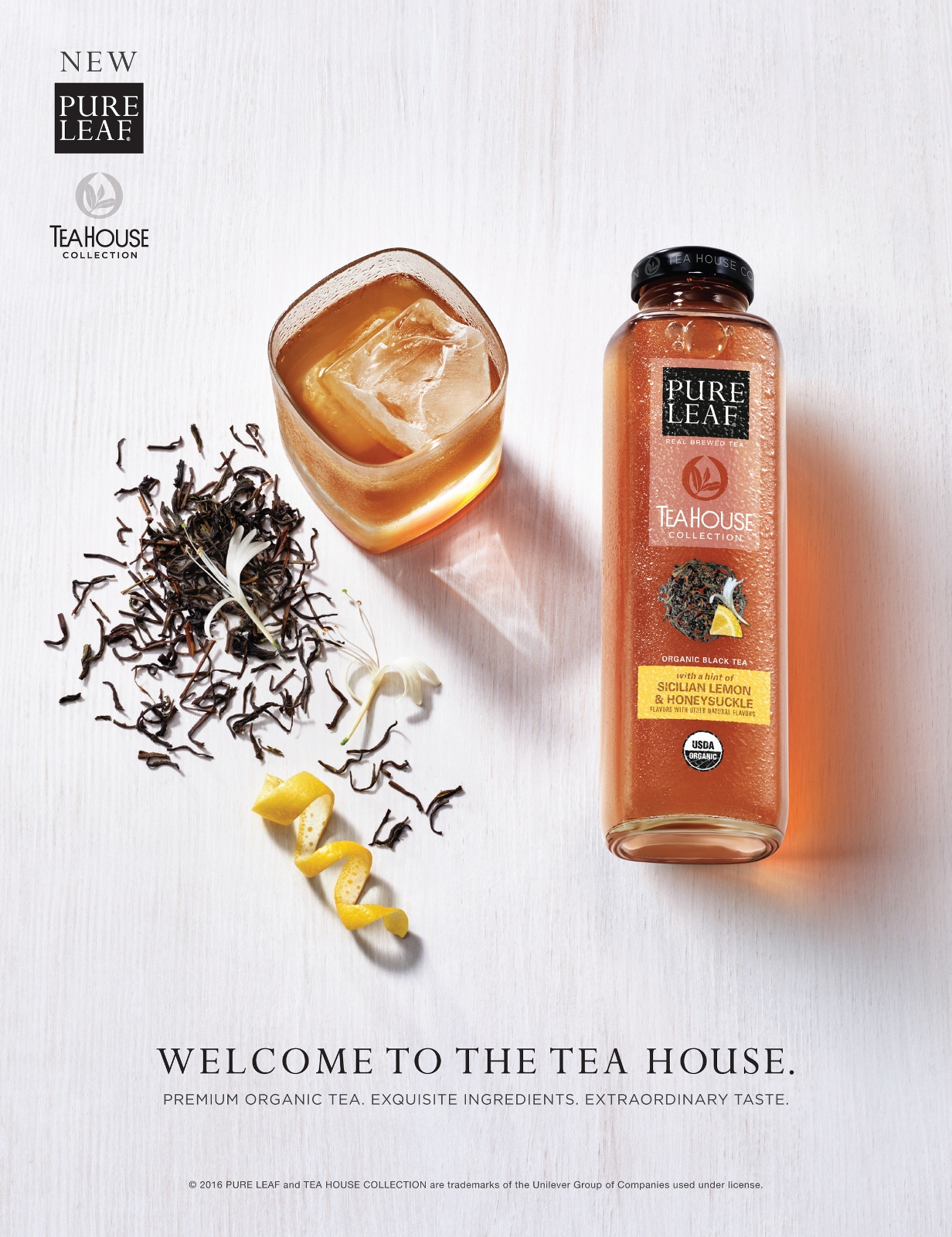
An elegant collection of premium tea. Worked with a talented design shop on this, and touched just about everything in this project, most notably bringing appetite appeal to dried tea leaves.

Everyone in the industry is well aware of the decline of the CSD, along with the growth of sparkling beverages. Sparkling waters have saturated the market, but sparkling tea officially belongs to Lipton! I partnered with a design agency in London to carve out a space for this interesting product - setting the gold standard for a category that should soon take off. For this pack we explored elegance and allure with the vibrant swirls of color and flowing bubbles and leaves, and balanced it with a word mark that is both whimsical and approachable.
The most exciting aspect of this design however is the idea that we might have created a category color... "Gilver", a carefully crafted custom mix of metallics gold and silver.
Pantone, it was my pleasure.

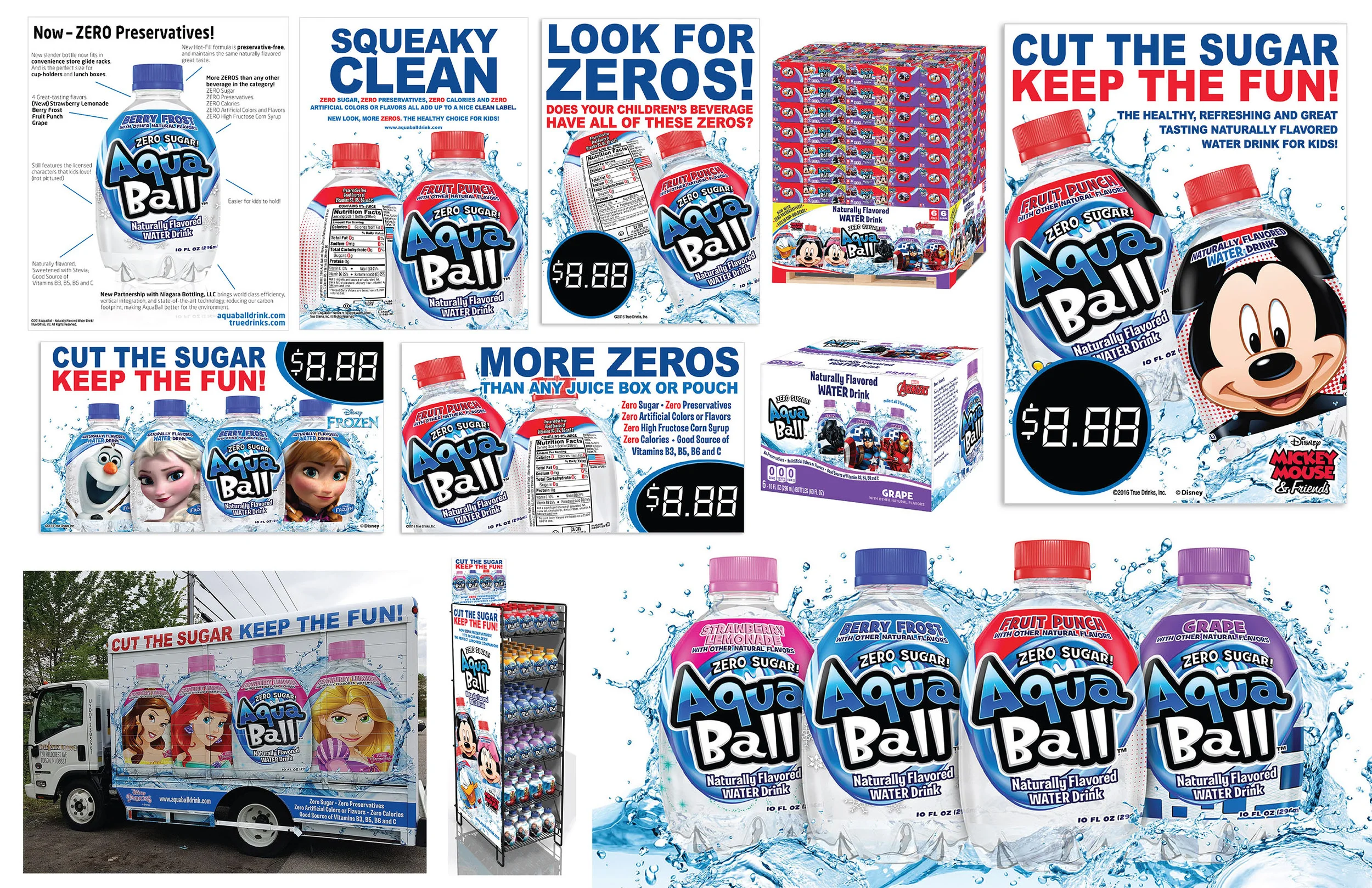
Packaging redesign for AquaBall 2.0, featuring a new logo to dramatically improve brand identity; an illustrated wave connecting brand panel to Disney®/Marvel® I.P. (not shown); strong color-blocking to compliment clear product show-through; and much cleaner benefits communication.

“What does Sweet Tea mean to you?”
That was my brief for Tristan Eaton. My brand partner and I were directly responsible for rebuilding the brand from the ground up, by developing the original concept, then launching the revolutionary "Refreshing Artists" packaging series in 2010. These designs showcased the soon-to-be burgeoning culture of street art, including original work from the likes of Matt Moore, Kiko Farkas, Morning Breath and Yuko Shimizu. We were excited to develop packaging that was even more compelling than the competitive 99¢ price point. Other ideas were considered (consumer-generated deviant photography being one of them), but we felt that original dynamic designs from artists spanning the globe would effectively reach our target bulls eye (multicultural urban youths), while not polarizing a much broader consumer group. As a result, Brisk joined PepsiCo's exclusive "Billion Dollar Brands" Club in 2012.
All because of a good idea and a seven word brief.
GDUSA Award Winner, 2010.

Exotic Iced Tea infused with the South American herb Yerba Mate. I worked with an agency to develop packaging which felt true to the origin and told a graphical story.

Due to limited distribution, dwindling shelf space and high COGS, SoBe was bleeding money with virtually no return on investment.
In order to rejuvenate the fading juices and teas business, I needed to create something revolutionary to ease core consumer uproar regarding the transition from the iconic glass bottle to a plastic replica. I also knew I had to design a package that was visually arresting enough in order to introduce the brand to a new generation of shoppers. What better than to tap into the strong brand heritage of snow, skate and surf culture? SoBe grew in popularity in the late 90’s and early 2000’s thanks to a massive grass roots movement and seemingly endless loop of action sports sponsorships... including a very successful partnership with Burton Snowboards. With a severe timeline, including coast-to-coast comsumer testing, I worked with Burton’s chief board design shop to develop labels that were both appetite-appealing and sensorially stimulating.
These bottles are wrapped 360º with graphics that could live beautifully on the back of any board. Mission accomplished.
GDUSA Award Winner, 2011.

The brand strategy was to capitalize on the industry’s rapidly exploding coconut water craze, by marketing a “coconut water for the people” - i.e. a non-polarizing, great tasting product offering a subtle amount of the ingredient for the perfect amount of hydration.
The design strategy was to explore vibrant category colors and innovative inks, leverage the beautiful contours of the uniquely shaped bottle and use the textures of the iconic lizard scales to create a quirky tropical canvas.
The result was company among the category leaders, and a gold standard for sales in the Lifewater family.
GDUSA Award Winner, 2011.
PepsiCo “Crushed Can” Award, 2011 (for crushing Coke)

The innovative Alumi-Tek bottle-can is a rugged structure that brought Dew marginal success in select regional U.S. markets in 2013. Even though research proved that it kept the product colder in the cooler, the design was no different than the standard plastic labels and cans. Looking for a unique way to convey to consumers "the coldest bottle on the shelf", I illustrated ice crystallization on to the pre-existing design, utilizing color-changing thermochromic ink technology. The back of the bottle featured a clever “chill meter” alerting interested consumers to the extreme temperature drop.
The tech served its purpose – aesthetically and functionally.
The Chill Bottle with color-changing ink brought the brand huge results within an incremental space, far exceeding targeted goal.

I wanted to craft some designs which captured both the energy of Dew and their two featured athletes, Paul Rodriguez and Danny Davis. These alluring 360º designs were featured nationally in 7-11 stores during the 2013 Dew Tour.

LTO for The Dark Knight Rises, with the logos lit up with pearlescent ink mixes. Also shown: special edition thermochromic can.

This multi-tiered promotion paired Dew with Call Of Duty (Modern Warfare 3), to form the largest entertainment launch and most successful consumer-activated program in PepsiCo history. While given exclusive access to some breathtaking video game creative elements, this design project (across several pack sizes) was tricky in that I could not show offensive graphics, down to the even smallest detail.
Strong leadership was key, as I was creative point to a demanding and “excitable” group, including the Dew brand team, PepsiCo senior executives, the game designers at Infinity Ward and their parent company, Activision. A trip out to I.W. headquarters in Southern California enabled me to take a crash course on game and environmental design, and truly dive into the world of Call Of Duty.

This work highlights the breadth of amazing ideas generated from my initial Brisk Re-launch brief, including some forward-thinking deviant photographic concepts - even prior to Instagram exploding into pop culture.


Some concept designs as part of a deep and meaningful exploration, the end result becoming Caleb's Kola. Actually used spray paint and stencils here!